Pie charts with numbers
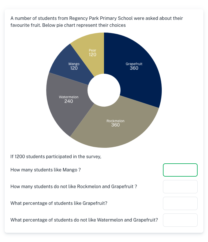
A pie chart shows a survey with each slice labelled by the number of people. The student answers how many, or what percentage, chose some options.
Turning counts into percentages of the total is the step most often missed. It's the partner to the percentage pie charts, which work the other way round.
Numbers&Me is free. Sign up to practise more, or set it as homework in under a minute, and it marks itself.
What changes each time
- Sports, sports cars and other surveys
- Combined slices and 'did not choose' questions
- Number and percentage questions
More data, graphs and probability practice
- Sort and count (Grade 1)
- Bar graphs (Grade 2)
- Reading pictographs (Grade 3)
- Line plots (Grade 3)
- Averages from a bar chart (Grade 3)
- Pie charts with percentages (Grade 4)
- Venn diagram problems (Grade 4)
- Probability with coins and dice (Grade 4)
- Does the coin remember? (Grade 4)
- Probability of picking two (Grade 5)
- True, false or no information (Grade 5)